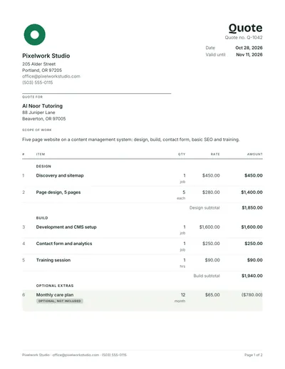
Modern quote template with the total up top
Customers look for the total first. This layout puts it and the valid until date at the top in large type, with one accent color and plenty of space.
- Five page tutoring website sample with a 40% deposit
- Design tips for quotes that read well on a phone
- Yours free, ready to brand with your logo
What makes a quote design modern
A modern quote template puts the number customers look for where they look first: the total and the valid until date sit at the top, in large type, above everything else. The rest follows the same idea, with one accent color, generous space and clean sans serif type. The sample is a five page website for a tutoring business with a 40% deposit.
Modern here means clarity rather than decoration. The layout ranks information by what the customer needs first, uses size and weight instead of boxes and borders to show importance, sticks to one accent color, and leaves enough white space for each block to read on its own, on paper or on a phone.
Modern
- Total and expiry at the top
- Large, heavy headings and figures
- One accent color, used sparingly
- Space and alignment separate the blocks
Traditional
- Total at the bottom of the last page
- One text size throughout
- Boxes, borders and shaded grids
- A letterhead band across the top
The Bold layout, block by block
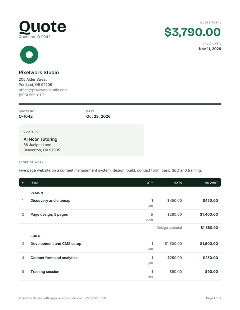
The sample uses the Bold design, the most modern of the eight designs in the quote maker. It opens with the word Quote in large type on the left and the quote total on the right, then a heavy rule, then the details. Everything below that rule follows the usual quote order, so nothing feels unfamiliar.
| Position | What appears | Why it is there |
|---|---|---|
| Top left | Quote in large display type, with the business identity below | Says what the document is at a glance |
| Top right | Quote total $3,790.00 and valid until Nov 11, 2026 | The two facts that decide whether the customer reads on |
| Under the rule | Quote number and date in one row | Reference details without clutter |
| Customer panel | Quote for, in a softly tinted panel | Separates the customer from your details |
| Lines | Numbered items grouped as Design and Build | Each stage priced on its own |
| Foot | Subtotal, deposit, balance, optional items and acceptance | The usual close, unchanged |
Quote template design principles that work
Good quote template design follows a few rules that hold whatever style you like. They are about the reader rather than fashion: make the important numbers easy to find, make every column line up, and remove anything that does not help the customer understand the price or say yes to it.
- One focal point. The total should be the largest figure on the page.
- Right aligned money. Decimal points stack, so amounts compare easily down the column.
- Two fonts at most. A display face for headings and a plain face for everything else.
- Color with a job. Use the accent for headings or the total, never for body text.
- Space before lines. Gaps between blocks separate them more quietly than borders do.
- Readable at phone width. Open the PDF on a phone before sending; small gray text vanishes on a narrow screen.
Choosing color, type and logo
Take your accent color from your logo or vehicle signage, so the quote looks like it belongs to the same business. Pick a mid to dark shade that stays readable as heading text and still prints clearly in grayscale. Place the logo once, at the top, and keep it modest so it never competes with the total.
- Test contrast on paper: a heading color that looks fine on a monitor can print too light.
- Avoid bright yellow and pale green for text, as both fade to almost nothing in black and white.
- Square or round logos sit best in the header; very wide ones may need to be smaller.
- The sample pairs a heavy sans serif display face with a neutral sans serif for body text.
- The quote maker remembers your logo in the browser along with your business details.
Modern quotation design on a phone
If your customer opens the quote on a phone, a modern quotation design pays off straight away: the total and expiry show without scrolling, and strong headings make the rest easy to skim with a thumb. Check how your own quote looks at phone width before you send it, not after the customer complains.
- The quote maker previews the customer’s phone view, with an Accept button, before you send anything.
- Put the total in your message as well, so the key figure is visible before the file even opens.
- Keep line descriptions short enough to wrap onto two lines at most on a narrow screen.
The sample modern quote, worked through
The sample prices a five page website in two stages, Design and Build, each with its own subtotal, plus a monthly care plan as an optional extra. A 40% deposit secures the start date. The prices are examples to show how the layout handles stages, not web design rates for any market.
| Line | Qty x rate | Amount |
|---|---|---|
| Discovery and sitemap | 1 job | $450.00 |
| Page design, 5 pages | 5 x $280 | $1,400.00 |
| Design subtotal | $1,850.00 | |
| Development and CMS setup | 1 job | $1,600.00 |
| Contact form and analytics | 1 job | $250.00 |
| Training session | 1 hr x $90 | $90.00 |
| Build subtotal | $1,940.00 | |
| Quote total | $3,790.00 | |
| Deposit to book, 40% | $1,516.00 | |
| Balance on completion | $2,274.00 | |
| Monthly care plan, optional | 12 months x $65 | $780.00, not included |
When a modern layout fits, and when it does not
Modern suits creative and digital businesses, newer brands and any customer likely to read on a phone. It is less suited to formal tenders, public sector buyers or conservative clients who expect a traditional letterhead with the total at the end. Choose the design that matches how your customers judge a supplier.
- More lines for web projects: the web design quote template
- A traditional formal look: the professional quote template
- A centered serif header for advisers: the quotation for services
- Light and minimal: the simple quotation format
Modern quote questions
What is a modern quote template?
It is a quote layout that puts the most important figures first and uses type, space and a single accent color to organize the page, instead of boxes and heavy borders. Ours shows the total and valid until date at the top in large type, with the lines and terms below in the usual order.
Why put the total at the top of a quote?
Because the total is usually what a customer wants to know first. Showing it at the top, beside the expiry date, saves them hunting through the lines and makes your quote easy to compare with others. The itemized lines still follow underneath, so nothing is hidden.
Can I use a modern design in Word or Excel?
Partly. The Word and Excel files share one structure across every style and use an accent color in the header and table, so they look clean but keep the total at the bottom. For the full Bold layout with the total at the top, use the online quote maker and download the PDF.
What fonts work best on a quote?
Plain, well spaced sans serif fonts read best on screens and print cleanly, Arial and Inter among them. Use a heavier weight or a larger size for headings and the total rather than a second decorative font, and keep body text at 9 to 11 pt so it stays readable on paper.
Does a modern design make a quote more likely to be accepted?
No layout guarantees a yes. What helps is clarity: a customer who can see the total, what it covers and how to accept has fewer reasons to delay. A modern layout makes those things easy to find, while the scope, the price and your follow up do the rest. See how to win more quotes.
How many designs does the quote maker have?
Eight: Forest, Band, Clean, Ledger, Site, Studio, Bold and Docket. Pick one in the editor, and each produces a real PDF with selectable text in A4 or US Letter. Bold is the one shown on this page, with the total in the header.